

Build a WordPress header without a plugin
A header is the one part of a website every visitor sees, and the part themes usually hide behind a settings screen with nine options in it. In Canvas a header is a record you build from blocks in the editor, so this guide is a build, not a tour of checkboxes.
Step 1: What a header is in Canvas
A header is a record, listed in the WordPress admin like a page, and edited in the same block editor. That single decision is what removes the header plugin from your stack.
Other themes build the header somewhere else. Blocksy and Astra both keep their header builders in the Customizer, a panel of settings beside the site, away from the editor you write pages in. Our Blocksy comparison sets the two approaches side by side.
The nesting
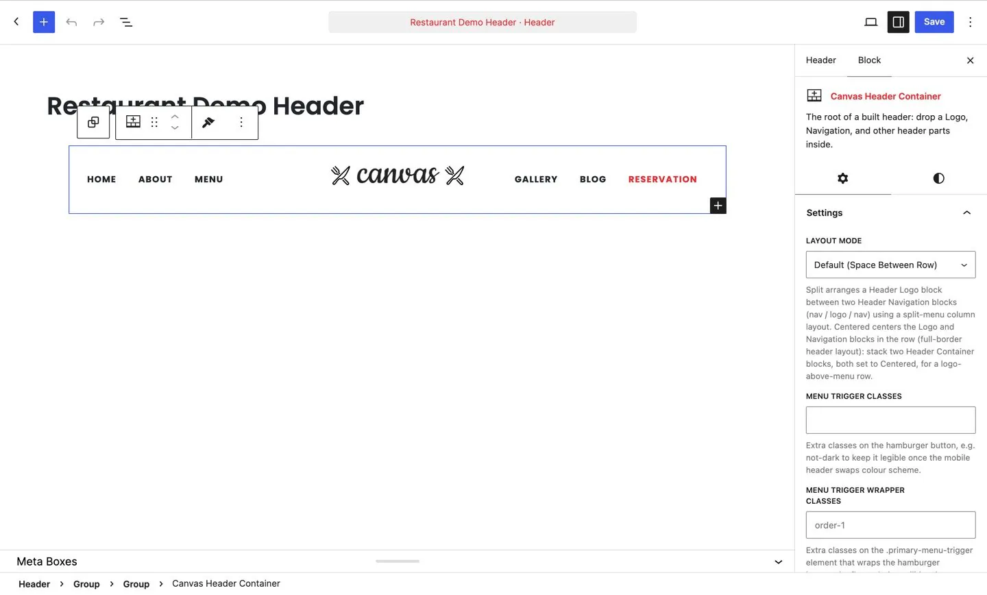
A header record holds a Header Root. The root holds a Header Container, which decides whether the header is boxed, full width, or one at one breakpoint and the other elsewhere. The container holds Header Zones, and a zone is a cell in the header row. The logo goes in one, the navigation in the next, a search icon and a cart in the last.
There are 14 blocks in the header family in total, and you will use four or five of them on a typical site. Everything else is there for the day you need a shop search, a language link or a block of opening hours in the corner.
Nothing about this is a separate editor. If you edit pages in WordPress, you can edit a header, and the same undo, block settings and keyboard shortcuts apply.
Step 2: Create the header record
Open the Headers list in the Canvas menu and add a new record. You have two honest starting points.
Start from a pattern
Insert a header pattern and you get ordinary blocks, arranged for you, ready to rearrange, rename or delete. Headers are the largest pattern category in the product, out of 183 patterns in total, so there is usually something close to the shape you want. This is the fastest route and the one to take on a first build.
Start from a demo
If you imported one of the 80 demo websites, its header is already a record on your site. Open it and change it, or duplicate it and experiment on the copy. Editing a working header teaches you the structure faster than an empty canvas does.
Give the record a name that says what it is for, such as Main header or Landing page header. You will have three of them within a month and the names are all you will have to tell them apart.
Step 3: Lay out the zones
Zones do the layout, which means you almost never fight with alignment classes.
- Push a zone to the edge. A left zone for the logo, a centre zone for the menu, a right zone for the actions is the arrangement most sites end up with.
- Group things that belong together. A search icon, a cart and a button in one zone stay a cluster, spaced as one group.
- Reorder per breakpoint. The zone that sits third on a desktop can sit first on a phone, without a second header record.
- Limit a zone to a device tier. Tell a zone to skip the devices that have no room for it, and nothing has to be hidden with CSS after the fact.
- Add your own classes to a zone when you want to reach it from a stylesheet of your own.
Build the desktop arrangement first and leave it alone until the parts are in. Layout decisions are much easier once real content is sitting in the row.
Step 4: Add the parts
Now fill the zones. Each of these is a block, and each has a settings panel with the options that block understands.
- Header Logo. Your logo, with separate files for the sticky state and the dark state, so a transparent header over a dark photograph does not need a workaround.
- Header Navigation. The main menu, with dropdowns and mega menu panels. It renders a WordPress menu, so the menu itself is still managed where you expect.
- Header Search. An icon that opens a field, or a field that is always open, whichever suits the design.
- Header Button. The call to action, with the usual size, style and link settings. One is persuasive, three are noise.
- Header Cart. The WooCommerce cart with its item count and a drop-down summary, for stores.
- Header Icon Link, Header Social and Header Info. A phone number, a row of social profiles, a small block of contact details, an address or opening hours.
Mega menus, when a list is not enough
A mega menu is its own record, designed as blocks and rendered by the Mega Menu block, so a menu item opens a full width panel of columns, images and buttons. Mega Menu Column keeps the panel on a grid. Reach for it when a category genuinely has structure, not to make a small site look busy.
Step 5: Sticky, transparent and the layout presets
Behaviour comes from presets, which are bundles of layout settings you apply in one click and then adjust. Pick the behaviour you want and change anything you like afterwards.
- Transparent. No background, so whatever sits behind the header shows through. Pair it with the dark or light logo variant so the wordmark stays legible.
- Semi-transparent. A translucent background, which keeps the image behind visible and the text readable. Usually the safer choice over a busy photograph.
- Floating, and floating semi-transparent or floating small, where the header sits inside the page with space around it, clear of the window edges.
- Full width sticky. Spans the viewport and stays pinned as the page scrolls.
- Sticky on scroll up. Leaves the top as the visitor scrolls down and returns when they scroll back up, which gives long pages their space back.
The site-wide settings behind them
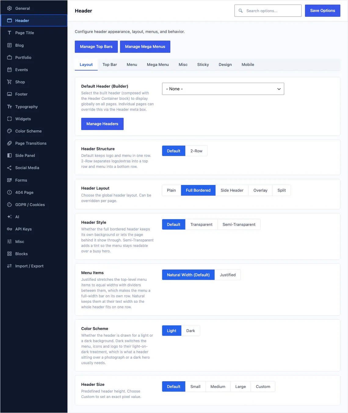
Header options are the largest section in Theme Options, with 92 of the 460 fields, and they carry the things no single record should own: the default header, sticky behaviour, height, spacing and the mobile breakpoint. A demo import fills them all in, and you change the ones you care about.
Step 6: The phone header
Most traffic arrives on a phone, so check this before you check anything else. The good news is that it is the same record.
- Reorder rather than rebuild. Move the logo to the centre, put the toggle on the left and a call button on the right, all through zone ordering.
- Drop what does not fit. Restrict the contact details or the social row to larger screens. Squeezing them onto a phone helps nobody.
- Keep the tap targets big. A menu toggle and a phone icon are the two things people aim at while walking.
- Set the breakpoint deliberately. The width at which the menu collapses is a setting, so a long menu can collapse earlier than a short one.
- Consider a side panel for the mobile menu. A side panel is a record that slides in from the edge, with room for a real menu, a search field and a button.
Check it in the editor, before you publish. Canvas renders the header in the editing canvas with the same code that renders it for a visitor, so the phone layout is something you look at while you build.
Step 7: Assign it, site-wide or per page
A record does nothing until something points at it. There are two levels, and they work the same way for every piece of chrome.
The site-wide default
Set the default header in Theme Options and every page uses it. Do the same for the top bar, the page title design and the footer. This is the setting that makes a new page look right the moment you publish it.
The per-page override
Any single page can override any of them from its own settings. A campaign landing page takes a transparent header and no top bar; the contact page keeps the standard one. Nothing is duplicated to achieve it, and nothing has to be remembered later, because the override lives on the page it affects.
Top bars
A top bar is its own record with its own blocks: a phone number, opening hours, a language switcher, an announcement. The Header Topbar block places it above the header row. Because it is separate, a holiday message changes across the whole site without opening the header at all.
Where to go from here
Two guides on why the header decides the wider question, and the builder itself.
Common questions
The full FAQ answers the rest, and the documentation covers every setting in detail.
Do I need a second header for mobile?
Usually not. Zones reorder per breakpoint and each one can be limited to a device tier, so a single record can centre the logo on a phone, drop the contact details and move the menu behind a toggle. Build a second record when you genuinely want a different design, not to repair a layout.
Can one page have a different header?
Yes. Headers, top bars, page titles and footers each have a site-wide default and a per-page override, so a campaign landing page can carry a transparent header over a photograph while every other page keeps the standard one.
Is this a widget area or a menu?
Neither. A header is a record you edit in the block editor, exactly like a page, and the logo, navigation, search, cart and buttons inside it are blocks with their own settings panels. Your WordPress menus are still WordPress menus; the Header Navigation block renders one.
What happens to my header when my licence expires?
Your site keeps rendering exactly as it does today. What pauses is the service: updates, demo imports, AI and editing of premium blocks stop until you renew, and there is a 14-day grace period if a licence check cannot reach our servers.
Build your next website with Canvas
Beginner, freelancer or agency, you get the same blocks, the same demos and the same support. Start with one site and add more when you need them.