

258 blocks for the WordPress block editor
Real blocks with real settings panels, inserted from the inserter WordPress gives you. No shortcodes, no proprietary canvas, no second editor to learn. Everything a visitor sees is a control in the sidebar.
202 blocks you can insert today
Filter by family or search by name, keyword or what the block does. Premium blocks are marked, and every plan includes all of them.
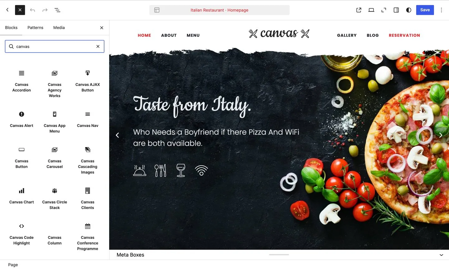
The inserter WordPress gives you, with the Canvas families under the core ones. Nothing here is a shortcode and nothing opens a second editor.
Showing all 202
Content
30 blocks, listed under Content in the block inserter.
Background Video / Audio Free
A self-hosted looping video or audio layer for a hero, section background or designed player. Emits just the media element, so the wrapper that positions it stays yours.
See it live: Background Video / Audio on Media Actions (opens in a new tab)
Cascading Images Included with any plan
Layered image composition with per-image translate, rotate, scale, z-index, animation delay, and optional decorative background shapes.
See it live: Cascading Images on Cascading Images (opens in a new tab)
Chart Included with any plan
Draw a chart from a data set you supply, so figures from a report or a price comparison can be read at a glance. The chart type, its data and its labels all come from the configuration you enter.
See it live: Chart on Services, Layout 1 (opens in a new tab)
Circle Stack Included with any plan
A horizontal stack of circular avatars, icons, or text badges: ideal for team teasers, social proof, and follower counts.
See it live: Circle Stack on Circle Stacks (opens in a new tab)
Clients Free
Display client, partner, or brand logos in a responsive grid or owl-carousel with optional linking and lightbox support.
Data Table Included with any plan
Lay out rows and columns of structured information, such as a specification list or a plan comparison, with column headings visitors can sort by and an optional summary row at the foot.
See it live: Data Table on User Profile (opens in a new tab)
Google Map Free
Embed a Google Map with custom markers, map type, zoom level, and style overrides.
Hover Card Free
Image card that tilts in 3D under the pointer, with a title and category caption that lift toward the viewer.
See it live: Hover Card on Hover Animations (opens in a new tab)
Icon Browser Free
Searchable reference grid of every icon in the enabled icon packs.
See it live: Icon Browser on Styled Icons (opens in a new tab)
Inline SVG Free
Vector icon drawn from SVG path data, with size, colour, viewBox and per-layer opacity as sidebar controls.
See it live: Inline SVG on Styled Icons (opens in a new tab)
Link Tiles Free
A grid of icon-and-label tiles, each linking to a page. Tiles pointing at a page that does not exist are left out.
See it live: Link Tiles on List Groups & Cards (opens in a new tab)
Lists & Cards Free
Bootstrap-based list groups and cards with multiple styles, colors, and layouts.
See it live: Lists & Cards on List Groups & Cards (opens in a new tab)
Media Embed Free
Place a video or audio player on the page from a hosting service, from a file you have uploaded, or from an embed address a provider gave you, sized to the aspect ratio you choose.
See it live: Media Embed on Media Embeds (opens in a new tab)
Nav Tree Free
An indented multi-level link tree: the navigation list a side panel or documentation sidebar uses.
See it live: Nav Tree on Side Navigation (opens in a new tab)
Navbar Free
Collapsible navigation bar with a brand, hamburger toggler, dropdown links and an optional trailing search form, button or text.
Overlay Content Free
One content layer inside an overlay: aligned, optionally masked, with trigger icons and nested blocks.
See it live: Overlay Content on Item Overlays (opens in a new tab)
Overlay Item Free
An image card with an overlay stacked on top of it: badge, tint layer, and one or more overlay content layers.
See it live: Overlay Item on Item Overlays (opens in a new tab)
Page Title Free
The page-title / hero bar. Drop a heading, subtitle, and breadcrumbs inside; choose alignment, a background image, parallax, and a dark scheme.
Page Title Buttons Free
Action buttons in the page-title band. Reads each page's own buttons in dynamic mode, or renders the buttons you author here. A button with no link becomes a scroll trigger.
See it live: Page Title Buttons on Buttons (opens in a new tab)
Particles Free
An animated particle background layer for a section: line web, starfield, bubbles, snow or low poly.
Preloader Free
An animated CSS loading indicator in any of the design system’s loader styles.
Pricing Switcher Included with any plan
Toggle switch that controls monthly/yearly (or any two-state) pricing display across paired Pricing Table blocks.
See it live: Pricing Switcher on Pricing (opens in a new tab)
Q&A Item Free
One question and its answer, each with its own marker: the building block of an interview.
Rounded Skills Free
Circular progress skill bars with animated percentage indicators.
See it live: Rounded Skills on Progress Bars & Skills (opens in a new tab)
Scroll Arrow Included with any plan
An animated scroll-down arrow for hero sections: smooth-scrolls to a target section anchor.
See it live: Scroll Arrow on Scroll Elements (opens in a new tab)
Star Rating Free
A star rating you set as a single score. Supports half stars, custom icons and an optional wrapper element.
Testimonials Free
Show what customers say about you as a grid, a rotating carousel or speech bubbles, with an author, a photo and a star rating on each quote.
See it live: Testimonials on Testimonials & Twitter (opens in a new tab)
Thumbnails Free
Image thumbnail grid with hover effects and optional captions. Supports lightbox and link overlays.
See it live: Thumbnails on Thumbnails & Slider (opens in a new tab)
Ticker Free
Scrolling announcement ticker with configurable items, direction, speed, and styling.
Twitter Feed Free
A rotating feed of an account's latest tweets, fetched when the page loads. Choose the account, how many to show and how the widget is laid out.
Posts
29 blocks, listed under Posts in the block inserter.
Agency Works Free
Display Portfolio projects as an agency-style carousel or grid, or render a single project page (attributes, contact CTA, related projects).
Blog Archive Loop Free
Blog loop for the main query (index, category, tag, author, date). Uses the theme blog-entry partials + pagination.
See it live: Blog Archive Loop on Blog | Grid (opens in a new tab)
Blog Loop Free
Composable blog entry loop. Compose the per-post card from Post Image/Title/Meta/Excerpt blocks; the container, pagination, and timeline chrome are layout-driven.
Blog Single Post Free
Single blog post layout (title, meta, image, content, tags, share, nav, author, comments, related + sidebar). For single.html.
See it live: Blog Single Post on News Blog demo (opens in a new tab)
Construction Projects Free
Display projects from the Projects post type as a portfolio grid (2 to 5 columns), or render a single project page (attributes, contact CTA, related projects).
See it live: Construction Projects on Projects | 5 Columns (opens in a new tab)
Interior Projects Free
Display studio projects from the Projects post type as a filterable portfolio grid, or render a single project page (details sidebar, consultation CTA, related projects).
See it live: Interior Projects on Stonecroft (opens in a new tab)
Law Firm Cases Free
Display cases from the Portfolio post type as cards, or render a single case page (attributes, contact CTA, related cases).
See it live: Law Firm Cases on Recent Cases (opens in a new tab)
Photo Shots Free
Display photographs from the Shots post type as an expanding preview grid, or render a single shot page (frame, capture details, enquiry CTA, related shots).
Post Archive Index Free
Every record as a date and a title, optionally grouped by year and month: the "everything we have published" index.
See it live: Post Archive Index on Blog | Grid (opens in a new tab)
Post Author Free
Displays the current post author bio card with avatar, display name, and biographical description.
See it live: Post Author on News Blog demo (opens in a new tab)
Post Comments Free
Renders the WordPress comments template including the comment list and submission form.
See it live: Post Comments on News Blog demo (opens in a new tab)
Post Content Free
Displays the full content of the current post, running all content filters including shortcodes and embeds.
See it live: Post Content on News Blog demo (opens in a new tab)
Post Date Free
The record's publication date on its own, for a byline the meta list cannot draw.
See it live: Post Date on News Blog demo (opens in a new tab)
Post Excerpt Free
Displays a word-trimmed excerpt of the current post with configurable length.
See it live: Post Excerpt on Blog | Grid (opens in a new tab)
Post Image Free
Displays the current post featured image with configurable size and optional permalink link.
See it live: Post Image on Blog | Mixed Feed (opens in a new tab)
Post Media Free
The entry media box of the current post: its featured image, video or audio embed, gallery slider, thumbnail grid, quotation, link or status card, chosen from the post format.
See it live: Post Media on Blog | Timeline Left Sidebar (opens in a new tab)
Post Meta Free
Displays configurable post meta including date, author, categories, and comment count.
See it live: Post Meta on Blog | Mixed Feed (opens in a new tab)
Post Navigation Free
Displays previous and next post navigation links for the current post.
See it live: Post Navigation on News Blog demo (opens in a new tab)
Post Read More Free
Renders a read more link or button pointing to the current post permalink.
See it live: Post Read More on Blog | Grid (opens in a new tab)
Post Reading Bar Free
Displays reading time, font-size, print, and share-scroll controls for the current post.
See it live: Post Reading Bar on News Blog demo (opens in a new tab)
Post Reading Time Free
How long the record takes to read, computed from its own body.
See it live: Post Reading Time on News Blog demo (opens in a new tab)
Post Related Free
Displays a grid of related posts from the same categories as the current post.
See it live: Post Related on News Blog demo (opens in a new tab)
Post Share Free
Displays social sharing links for the current post with configurable networks, style, and size.
See it live: Post Share on Event Single (opens in a new tab)
Post Terms Free
Displays taxonomy terms (categories or tags) for the current post with text, badge, pill, tag-cloud, or inline-category styles.
See it live: Post Terms on Blog | Mixed Feed (opens in a new tab)
Post Title Free
Displays the current post title inside a configurable heading tag with an optional permalink link.
See it live: Post Title on Blog | Mixed Feed (opens in a new tab)
Post Table of Contents Free
An index of the post's own headings, with working anchors and a marker that follows the reader.
See it live: Post Table of Contents on News Blog demo (opens in a new tab)
Posts Free
Query and display posts in a variety of layouts including grid, list, masonry, and timeline. Supports filtering by category, tag, custom post type, and ordering.
Recent Comments Free
The latest approved comments from across the site, each with the commenter's avatar, name and opening words, linking into the thread.
See it live: Recent Comments on Widgets (opens in a new tab)
Resume Works Free
Display projects from the Works post type as a compact list or a tile grid, or render a single project page (attributes, CTA, related projects).
Canvas
28 blocks, listed under Canvas in the block inserter.
Alert Free
Alert and notification boxes using Bootstrap alert or Canvas style-msg system. Supports filled, bordered, and extended variants with optional icon and dismiss button.
Button Free
Fully featured button with style variants, sizes, shapes, colors, icons, hover effects, and shadow options.
Code Highlight Included with any plan
Syntax-highlighted code block powered by Prism.js. Supports 15+ languages with an optional clipboard copy button.
See it live: Code Highlight on Code Highlighter (opens in a new tab)
Counter Free
Animated number counter with icon, prefix/suffix, and caption label.
Divider Free
Horizontal divider with optional icon, style variants, alignment, width presets, and scroll-to link support.
Dropcap Free
Styled dropcap letter with accompanying paragraph text. Supports boxed, bordered, circle, and circle-bordered variants with left or right positioning.
See it live: Dropcap on Headings & Dropcaps (opens in a new tab)
Heading Free
Styled heading with optional subtitle. Supports Heading Block, Title Block, Emphasis Title, and Fancy Title types.
See it live: Heading on Headings & Dropcaps (opens in a new tab)
Highlight Free
Highlighted text with configurable style variants including marker, underline, gradient, outline, and text-only. Supports optional before/after surrounding copy and any block-level HTML tag.
See it live: Highlight on Headings & Dropcaps (opens in a new tab)
Icon Box Free
Feature box with icon, title, and description. Supports multiple icon styles, sizes, layouts, and hover effects.
See it live: Icon Box on Featured Boxes (opens in a new tab)
Icon List Free
Icon list with repeater items. Each item has an icon (CSS class), text label, and optional link. Supports default, large, and extra-large size variants.
Login Form Included with any plan
Renders a WordPress login form with Canvas styling. Shows a welcome message to logged-in users.
See it live: Login Form on Login & Register (opens in a new tab)
Notification Free
Display a toast notification triggered by a button click or automatically on page load.
See it live: Notification on Notifications (opens in a new tab)
Page Title Breadcrumbs Free
Renders a breadcrumb trail (Home > Parent > Current) for the current page or post.
See it live: Page Title Breadcrumbs on Page Titles (opens in a new tab)
Page Title Heading Free
Renders the page / post title as a heading. Supports dynamic (context) and static (literal) source modes.
See it live: Page Title Heading on Page Titles (opens in a new tab)
Page Title Subtitle Free
Renders the page subtitle. Reads _canvas_page_subtitle meta in dynamic mode, or displays custom text in static mode.
See it live: Page Title Subtitle on Page Titles (opens in a new tab)
Plain Image Free
A bare img element (no figure wrapper) with exact class control, optional link, and optional retina (2x) srcset pair.
See it live: Plain Image on Lazy Loading (opens in a new tab)
Portfolio Excerpt Included with any plan
Displays a trimmed excerpt for the current portfolio item.
See it live: Portfolio Excerpt on Portfolio demo (opens in a new tab)
Pricing Table Included with any plan
Flexible pricing box card. Supports default, simple, minimal, and extended layouts with optional pricing switcher, feature list, and CTA button.
Process Steps Free
Numbered or icon step indicators with dashed connector lines. Optionally enables Bootstrap 5 tab content with prev/next navigation.
See it live: Process Steps on Process Steps (opens in a new tab)
Progress Bar Free
Animated skill/progress bar with percentage counter, horizontal or vertical orientation, and Bootstrap stripe patterns.
See it live: Progress Bar on Progress Bars & Skills (opens in a new tab)
Promo Box Free
Promotional call-to-action box with heading, subtext, and CTA button. Supports default, border, light, and dark styles.
Quote Free
Blockquote with default border, icon quote, and speech bubble styles. Supports reverse alignment, citation footer, and optional border/icon color overrides.
See it live: Quote on Quotes & Blockquotes (opens in a new tab)
Read More Free
Collapsible content area with animated expand/collapse triggered by a read-more link.
Register Form Included with any plan
A user registration form with Canvas styling. Requires user registration to be enabled in WordPress settings.
See it live: Register Form on Login & Register (opens in a new tab)
Shape Divider Free
SVG decorative shape divider for section transitions.
See it live: Shape Divider on Shape Dividers (opens in a new tab)
Social Icons Free
Group of social icon links with hover animation, multiple styles, sizes, and optional sticky positioning.
See it live: Social Icons on Social Icons (opens in a new tab)
Styled Icon Free
Standalone icon with filled, bordered, or plain style, shape variants, color options, and optional link.
See it live: Styled Icon on Styled Icons (opens in a new tab)
Team Member Free
Team member cards with grid, overlay, and list layouts. Supports photos, bio, profile links, and social icon links.
Interactive
25 blocks, listed under Interactive in the block inserter.
Accordion Free
Stack titled panels that open and close, so a long run of questions or reference material fits on one page and visitors expand only the parts they need.
See it live: Accordion on Toggles & Accordions (opens in a new tab)
AJAX Button Free
Button that loads external content via AJAX into a container. Supports append, prepend, and replace insertion modes.
See it live: AJAX Button on AJAX Button (opens in a new tab)
Carousel Free
Responsive owl-carousel slider with per-breakpoint item counts, autoplay, navigation arrows, dots, lightbox, and lazy-load support.
Countdown Included with any plan
Countdown or count-up timer powered by the jQuery countdown plugin.
Flip Cards Included with any plan
Interactive 3D flip cards with configurable front and back faces, icon, title, subtitle, rich-text content, CTA button, and per-face background image or color.
Gallery Free
Image gallery with masonry support, configurable columns, gap control, and optional lightbox.
Cookie Consent Free
Cookie consent bar with a privacy preferences modal and per-service consent toggles.
See it live: Cookie Consent on GDPR Layout 2 (opens in a new tab)
Hover 3D Free
Card with a CSS perspective tilt effect on mouse-move powered by the theme JS module.
See it live: Hover 3D on Hover Animations (opens in a new tab)
Image Compare Included with any plan
Before/after image comparison slider with configurable orientation, offset, handle style, and side labels.
See it live: Image Compare on Image Compare (opens in a new tab)
Image Hotspot Included with any plan
Interactive image with positioned hotspot pins that reveal tooltips on hover or click.
See it live: Image Hotspot on Item Overlays (opens in a new tab)
Image Slider Included with any plan
FlexSlider-powered image slider with slide/fade animation, autoplay, arrows, dots, thumbnail nav, and touch-swipe support.
See it live: Image Slider on Image Sliders (opens in a new tab)
Modal Included with any plan
Trigger a modal / popup dialog from a button, link, or auto-open on page load.
Nav Free
A tabs / pills / underline navigation strip with active and disabled states and one-level dropdowns.
Off-Canvas Free
A Bootstrap 5 off-canvas sliding panel (start / end / top / bottom) opened by a button or link.
Pagination Free
A pagination row: circle, rounded, pill, 3D, transparent or button styling, in three sizes and any alignment.
See it live: Pagination on Paginations & Progress Bars (opens in a new tab)
Parallax Image Included with any plan
Full-width parallax image section with optional overlay and content.
See it live: Parallax Image on Parallax Elements (opens in a new tab)
Scroll Reveal Included with any plan
Animate content into view as the user scrolls down the page.
See it live: Scroll Reveal on Scroll Elements (opens in a new tab)
Slider Included with any plan
Embed a Canvas slider anywhere on the site by selecting it. Slides, effects, navigation, and height are configured on the slider itself.
Tab Strip Free
A tab strip whose panels are ordinary blocks elsewhere on the page.
Tabs Free
Split related content across labelled tabs so visitors read one section at a time, which keeps a long comparison or specification page short enough to scan.
Text Fill Scroll Included with any plan
Progressively fills text color as the element scrolls into view.
See it live: Text Fill Scroll on Scroll Elements (opens in a new tab)
Text Rotator Free
Animated rotating or typed text within a heading element.
See it live: Text Rotator on Headings & Dropcaps (opens in a new tab)
Toggle Free
Hide one piece of content behind a heading a visitor clicks to reveal, for a long answer or a set of terms that should not take up the page by default.
See it live: Toggle on Toggles & Accordions (opens in a new tab)
Video Facade Free
Lazy-load video embed behind a thumbnail image; iframe loads only on click for faster pages.
See it live: Video Facade on Video Facade (opens in a new tab)
YouTube Background Free
YouTube video playing as an ambient muted background behind overlay content.
See it live: YouTube Background on Event Single | Full Width Video (opens in a new tab)
WooCommerce
22 blocks, listed under WooCommerce in the block inserter.
Conference Tickets Included with any plan
Pricing boxes for a category of ticket products, each with a quantity select and a live add-to-cart link.
See it live: Conference Tickets on Shop (opens in a new tab)
Store Price Filter Included with any plan
A double-handle price range control that filters a product grid in place.
See it live: Store Price Filter on Shop with Combination Filters (opens in a new tab)
Add to Cart Included with any plan
Renders the WooCommerce add-to-cart form for the current product with optional quantity input.
Cart Table Included with any plan
Display the WooCommerce cart table with line items, quantities, and totals.
Cart Totals Included with any plan
Display the WooCommerce cart totals panel including subtotal, shipping, and checkout button.
Checkout Billing Included with any plan
Display the WooCommerce checkout billing address form.
See it live: Checkout Billing on Christmas Checkout (opens in a new tab)
Checkout Order Review Included with any plan
Display the WooCommerce checkout order review summary with line items and totals.
See it live: Checkout Order Review on Christmas Checkout (opens in a new tab)
Cross-Sells Included with any plan
Displays cross-sell products from the current WooCommerce cart. Only renders when the cart is active and contains cross-sell products.
WooCommerce Notices Included with any plan
Display WooCommerce notices: errors, success messages, or informational notices.
See it live: WooCommerce Notices on Cart (opens in a new tab)
Product Carousel Included with any plan
Display WooCommerce products in a scrollable owl-carousel. Supports autoplay, navigation arrows, dots, and responsive breakpoints.
Product Categories Included with any plan
Display WooCommerce product categories as a responsive card grid with thumbnails, names, and product counts.
See it live: Product Categories on Shop Categories Parallax Showcase (opens in a new tab)
Product Gallery Linker Included with any plan
A thumbnail strip that moves a product gallery carousel to the image you click.
See it live: Product Gallery Linker on Store demo (opens in a new tab)
Product Images Included with any plan
Displays the WooCommerce product featured image and optional gallery thumbnails.
See it live: Product Images on Store demo (opens in a new tab)
Product Meta Included with any plan
Displays the product meta card: SKU, categories, and tags.
See it live: Product Meta on Store demo (opens in a new tab)
Product Price Included with any plan
Displays the WooCommerce product price including sale price and currency formatting.
See it live: Product Price on Store demo (opens in a new tab)
Product Rating Included with any plan
Displays the star rating and optional review count for the current WooCommerce product.
See it live: Product Rating on Store demo (opens in a new tab)
Product Share Included with any plan
Displays the "Share:" card with social sharing links for the current WooCommerce product.
See it live: Product Share on Store demo (opens in a new tab)
Product Short Description Included with any plan
Displays the product short description with its paragraph markup intact.
See it live: Product Short Description on Store demo (opens in a new tab)
Product Tabs Included with any plan
Renders the WooCommerce product data tabs: Description, Additional Information, and Reviews.
See it live: Product Tabs on Store demo (opens in a new tab)
Products Included with any plan
Display WooCommerce products in a grid or list layout. Filter by source, category, tag, and ordering.
Related Products Included with any plan
Displays a grid of WooCommerce products related to the current product. Only renders on single-product templates.
See it live: Related Products on Store demo (opens in a new tab)
Variation Swatches Included with any plan
Colour dots or button pills that choose a variable product's variation.
See it live: Variation Swatches on Store demo (opens in a new tab)
Layout
20 blocks, listed under Layout in the block inserter.
Column Free
A responsive grid column (.col-*). Set per-breakpoint widths and place any content inside.
Container Free
A responsive .container wrapper. Place rows and columns inside to build section layouts.
See it live: Container on Columns & Grids (opens in a new tab)
Copyrights Free
The footer copyrights bar: a copyright line with links on the left and an inline menu on the right. Use the Bare layout to render just the left-hand piece for hand-composed 2-column bars.
See it live: Copyrights on Footer - Layout 2 (opens in a new tab)
Footer About Free
A footer "About" column with logo, description and optional address, using the .footer-logo markup.
See it live: Footer About on Footer - Layout 2 (opens in a new tab)
Footer Contacts Free
Large label/value contact rows using the .footer-big-contacts markup and styling.
See it live: Footer Contacts on Footer - Layout 3 (opens in a new tab)
Footer Instagram Free
A footer Instagram / photo-stream widget: a masonry grid of images with optional links, using the .masonry-thumbs markup.
See it live: Footer Instagram on Footer - Layout 4 (opens in a new tab)
Footer Widget Area Free
The root of a built footer widget row: drop Footer About, Widget Links, Footer Contacts, Subscribe, or Footer Instagram blocks inside.
See it live: Footer Widget Area on Footer - Layout 2 (opens in a new tab)
Grid Filter Included with any plan
Isotope category filter bar (.grid-filter) that drives Isotope-filterable grids. Source items from a taxonomy or a manual list.
See it live: Grid Filter on Portfolio Filter Styles (opens in a new tab)
Hero Free
Renders the hero each page assigns in its Hero panel, or one hero you pick. Compose heroes under Canvas → Heroes.
Image Element Free
A bare image with no figure or caption around it, for logos and badges that sit inline beside other content.
Inline Contact Free
A flat inline run of icon + text contact items (email, phone, Skype, etc.) joined by middot separators: the #copyrights bar contact line.
Inline Text Free
A run of text that sits directly inside its container, with no paragraph or span of its own. Inline leaves only.
See it live: Inline Text on Headings & Dropcaps (opens in a new tab)
Line Break Free
A single line break used as a spacing device. Add responsive classes in the Advanced panel to break the row only on some screen sizes.
See it live: Line Break on Headings & Dropcaps (opens in a new tab)
Page Title Free
Renders the page title band each page shows under its header, as set in the page's Page Title panel and in Theme Options. The band itself is the Page Title template part.
Quantity Input Free
A .quantity stepper: a number input flanked by minus/plus buttons. Static and product-agnostic, pair with a button for an "Add to Cart" row.
See it live: Quantity Input on Cart Quantity (opens in a new tab)
Row Free
A grid row. Place Canvas Column blocks inside to lay out content in a responsive grid.
Page Slider Free
Renders the slider each page assigns in its Slider panel, or one slider you pick. Slides, effects and height are configured on the slider itself.
See it live: Page Slider on Canvas Slider (opens in a new tab)
Subscribe Widget Included with any plan
Footer social call-out items (icon + "Like us / on Facebook" text) using the .subscribe-widget markup.
See it live: Subscribe Widget on Widgets (opens in a new tab)
Widget Links Free
A footer link-list column using the .widget_links markup and styling.
Wrapper Free
A bare HTML element that carries only the classes you give it and holds other blocks inside. Use it when a design needs an exact wrapper element without any extra editor classes.
Header
19 blocks, listed under Header in the block inserter.
App Menu Free
An app-style navigation bar pinned to the bottom of the screen on small devices.
See it live: App Menu on Menu - App Style 1 (opens in a new tab)
Header Button Free
A call-to-action button/link for a built header, styled with the theme's button classes.
See it live: Header Button on Hosting demo (opens in a new tab)
Header Cart Free
The WooCommerce mini-cart icon + dropdown for a built header. Renders nothing when WooCommerce is inactive.
See it live: Header Cart on Restaurant demo (opens in a new tab)
Header Container Free
The root of a built header: drop a Logo, Navigation, and other header parts inside.
See it live: Header Container on Restaurant demo (opens in a new tab)
Header Icon Link Free
A single icon-only link for a built header (wishlist, account, user, cart trigger, login modal), using the .header-misc-icon markup.
See it live: Header Icon Link on Restaurant demo (opens in a new tab)
Header Info Free
A small inline info/contact element (phone, email, hours, or text) with an optional icon and link for a built header.
See it live: Header Info on Restaurant demo (opens in a new tab)
Header Logo Free
The site logo for a built header. Uses the Site Logo from Theme Options by default, or a chosen image override.
See it live: Header Logo on Restaurant demo (opens in a new tab)
Header Navigation Free
The primary navigation menu for a built header. Pick a menu and alignment.
See it live: Header Navigation on Restaurant demo (opens in a new tab)
Header Root Free
The outermost element of a built header: carries variant classes and data-sticky-* attributes read by the theme's sticky-header script. Drop the #header-wrap group (and any other header content) inside.
See it live: Header Root on Restaurant demo (opens in a new tab)
Header Search Free
The header search toggle. Emits the #top-search trigger the theme search dropdown is wired to.
See it live: Header Search on Restaurant demo (opens in a new tab)
Header Shop Search Free
An always-visible product search field for a header row: the storefront and directory alternative to the header search toggle. Choose a bare field with a resting glyph or an input group with a submit button.
See it live: Header Shop Search on Restaurant demo (opens in a new tab)
Header Social Free
A row of social / contact icon links for a built header, using the top-social markup and styling.
See it live: Header Social on Restaurant demo (opens in a new tab)
Header Topbar Free
The slim utility row above a built header (#top-bar): drop Top Links, Header Social, Header Info, or a Language Switcher inside.
See it live: Header Topbar on Restaurant demo (opens in a new tab)
Header Zone Free
A positioning slot inside a Header Container row: drop a Logo, Navigation, or a small cluster of header parts inside, then use the alignment/order/visibility fields to place it.
See it live: Header Zone on Restaurant demo (opens in a new tab)
Icon Nav List Free
A vertical Bootstrap .nav icon-link list (nav-item > nav-link > icon + text), used by off-canvas menu panels.
See it live: Icon Nav List on Menu - App Style 1 (opens in a new tab)
Language Switcher Free
A compact language dropdown for a built header: shows the current language and lists the others, using the primary-menu with-arrows markup.
See it live: Language Switcher on Menu - Style 10 (opens in a new tab)
Mega Menu Column Included with any plan
A single mega-menu column (.mega-menu-column): a heading + link list, flat links, or free widget content. Place one or more inside a Row block as your Mega Menu content (Appearance > Menus > Mega Menu still controls the outer panel type/style).
See it live: Mega Menu Column on Mega Menu (opens in a new tab)
Page Menu Free
A sub-header page navigation bar with sticky and side-dots variants: one-page anchor scrolling or plain links. Use only one per page.
See it live: Page Menu on Page with Submenu (opens in a new tab)
Top Links Free
The top-bar links menu with optional single-level dropdown, using the .top-links markup and styling.
See it live: Top Links on Menu - Style 10 (opens in a new tab)
Events
16 blocks, listed under Events in the block inserter.
Conference Programme Included with any plan
Day-tabbed session agenda, or a row of upcoming-event cards, built from the event records.
See it live: Conference Programme on Conference demo (opens in a new tab)
Event Archive Grid Included with any plan
Events grid for the main query (archive + category). Uses the event-entry-grid partial + shared pagination.
See it live: Event Archive Grid on Events List (opens in a new tab)
Event Categories Included with any plan
Displays the categories assigned to the current event. Supports text, badge, and pill styles. Only renders on canvas_event post type.
See it live: Event Categories on Events List (opens in a new tab)
Event Content Included with any plan
Renders the full post content of the current event through the_content filter. Only renders on canvas_event post type.
See it live: Event Content on Event Single (opens in a new tab)
Event Date Included with any plan
Displays the event start and end dates with optional time and calendar icon. Only renders on canvas_event post type.
See it live: Event Date on Conference demo (opens in a new tab)
Event Excerpt Included with any plan
Displays a trimmed excerpt for the current event.
See it live: Event Excerpt on Conference demo (opens in a new tab)
Event Image Included with any plan
Displays the featured image of the current event. Only renders on canvas_event post type.
See it live: Event Image on Event Single (opens in a new tab)
Event Location Included with any plan
Displays the event venue name and address with an optional Google Maps link and location icon. Only renders on canvas_event post type.
See it live: Event Location on Conference demo (opens in a new tab)
Event Meta Included with any plan
Displays event metadata: date, location, organizer, and price. Each field can be toggled independently. Only renders on canvas_event post type.
See it live: Event Meta on Event Single | Both Sidebars (opens in a new tab)
Event Navigation Included with any plan
Renders previous and next event navigation links with configurable labels and optional thumbnails. Only renders on canvas_event post type.
See it live: Event Navigation on Event Single | Both Sidebars (opens in a new tab)
Event Organizer Included with any plan
Displays the event organizer with an optional link to their website and a person icon. Only renders on canvas_event post type.
See it live: Event Organizer on Conference demo (opens in a new tab)
Event Posts Included with any plan
Queries and displays canvas_event posts in a responsive card grid. Supports filtering by upcoming, past, or all events. Can be placed on any page.
See it live: Event Posts on Events List (opens in a new tab)
Event Price Included with any plan
Displays the event price, or a configurable free label when no price is set. Supports text and badge styles. Only renders on canvas_event post type.
See it live: Event Price on Conference demo (opens in a new tab)
Related Events Included with any plan
Displays a grid of related events based on shared categories. Only renders on canvas_event post type.
See it live: Related Events on Conference demo (opens in a new tab)
Event Title Included with any plan
Displays the current event title inside a configurable heading tag with an optional permalink link. Only renders on canvas_event post type.
See it live: Event Title on Conference demo (opens in a new tab)
Events Calendar Included with any plan
A month-grid calendar of your events, with previous / next / today controls. Each day links to the events happening on it.
See it live: Events Calendar on Events Calendar (opens in a new tab)
Portfolio
8 blocks, listed under Portfolio in the block inserter.
Portfolio Archive Grid Included with any plan
Portfolio grid for the main query (archive + category). Uses the portfolio-entry-grid partial + #portfolio overlay grid.
See it live: Portfolio Archive Grid on Portfolio demo (opens in a new tab)
Portfolio Categories Included with any plan
Displays the taxonomy categories assigned to the current portfolio project. Use inside portfolio single templates.
See it live: Portfolio Categories on Portfolio demo (opens in a new tab)
Portfolio Content Included with any plan
Displays the full content of the current portfolio project. Use inside portfolio single templates.
See it live: Portfolio Content on Portfolio demo (opens in a new tab)
Portfolio Image Included with any plan
Displays the media region of the current portfolio project: featured image, gallery slider, project video, or thumbnail grid. Use inside portfolio single templates.
See it live: Portfolio Image on Portfolio demo (opens in a new tab)
Portfolio Meta Included with any plan
Displays the portfolio project details: client, date, skills, and URL. Use inside portfolio single templates.
See it live: Portfolio Meta on Portfolio demo (opens in a new tab)
Portfolio Navigation Included with any plan
Displays previous and next portfolio project navigation links. Use inside portfolio single templates.
See it live: Portfolio Navigation on Portfolio demo (opens in a new tab)
Portfolio Related Included with any plan
Displays related portfolio projects based on shared categories. Use inside portfolio single templates.
See it live: Portfolio Related on Portfolio demo (opens in a new tab)
Portfolio Title Included with any plan
Displays the current portfolio project title. Use inside portfolio single templates.
See it live: Portfolio Title on Portfolio demo (opens in a new tab)
Forms
5 blocks, listed under Forms in the block inserter.
Form Included with any plan
A working form. Place Form Field and Form Submit blocks inside: submissions are validated, saved and emailed.
Form Embed Included with any plan
Embed a Canvas form anywhere on the site by selecting its Form ID.
See it live: Form Embed on Forms Styles (opens in a new tab)
Form Field Included with any plan
A single form input field. Use inside a Canvas Form to collect user input.
See it live: Form Field on Form Elements (opens in a new tab)
Form Submit Button Included with any plan
The submit button for a Canvas form. Supports style variants, size, full-width mode, and an icon.
See it live: Form Submit Button on Forms Styles (opens in a new tab)
Quick Contact Included with any plan
A compact "Quick Quotation" contact form widget (name / email / message), styled with the Canvas form CSS.
56 blocks that arrive with their demo
Some designs need a block that only makes sense inside that design. Those blocks are always registered, so a demo you imported keeps rendering forever, but they stay out of the inserter on sites that never asked for them.
Posts 37
Barber Items, Beauty Kits, Bike Rentals, Cafe Menu, Campaigns, Care Services, Causes, Cleaner Team, Cleaning Services, Conference Speakers, Conference Sponsors, Coworking Spaces, Creator Showcase, Doctors, Estate Properties, Event Schedule, Event Speakers, Gaming Matches, Headphone Product, Headphone Stores, Hostel Rooms, Insurance Coverage, Medical Departments, Medical Doctors, Medical Specialties, Menu Items, Moving Services, Pet Services, Photographer Shots, Recipe Items, Residences, Spa Treatments, Therapy Treatments, Travel Hotels, Travel Packages, Wine Tastings, Yoga Classes.
Content 7
Article Cards, Finance Calculator, Forum Discussion, Forum Members, Forum Topics, Recipe Categories, Rental Calculator.
WooCommerce 3
Event Passes, Gear Products, Store Products.
Header 3
Forum Header Dropdown, Forum Search Overlay, Photographer Menu.
Interactive 3
Domain Search, Host Price, Host Slider.
Portfolio 2
Portfolio Grid, Videographer Works.
Other 1
Movers Posts.
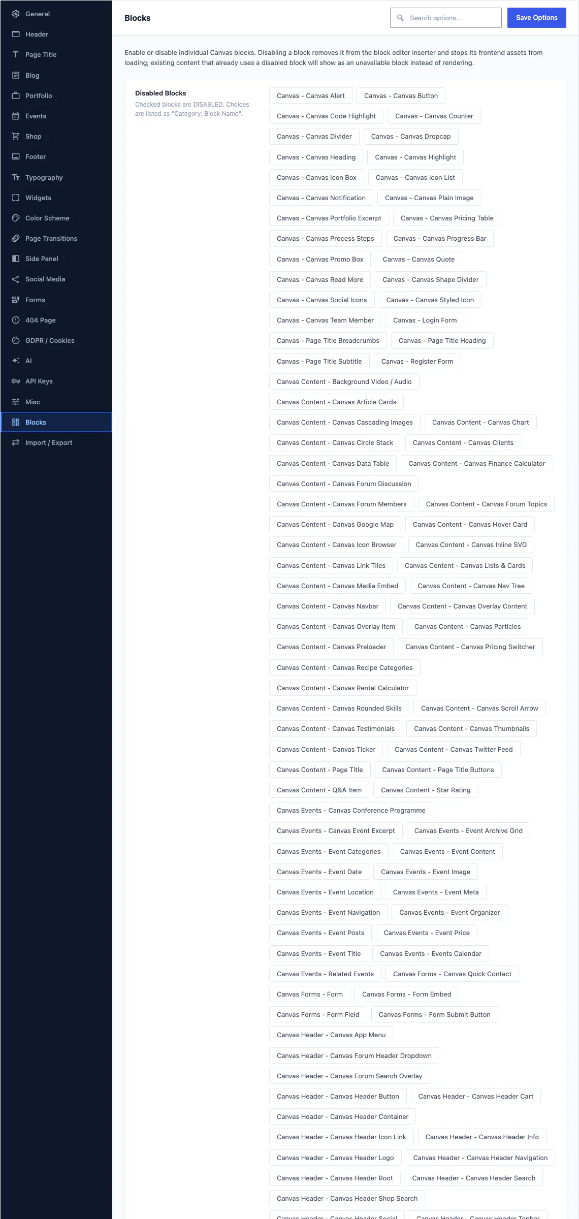
Theme Options lists every block Canvas registers, demo-scoped ones included, each with a switch that takes it out of the inserter and stops its front-end assets loading.
Import a demo and its blocks appear in the pages it built, fully editable, with the same settings panels every other Canvas block has. Roll the demo back and they leave with it.
Every block has these
Seven settings sit on every block Canvas registers, and the first four sit on core and third-party blocks too, because they are added to the editor rather than to our blocks.
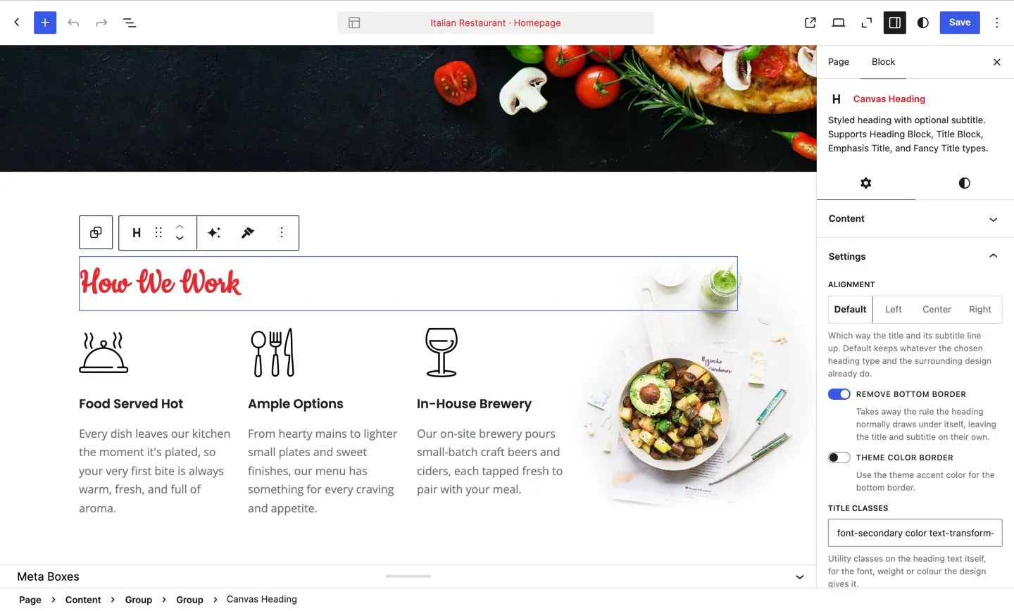
The sidebar of a selected block. Everything a visitor sees is a control here, which is why there is no code view to open.
Animation
Reveal a block as it enters the viewport, with a speed, a delay and an optional exit animation. Motion respects a visitor's reduced-motion preference.
Custom CSS
Write CSS for one block instance when a core control cannot express what you want. It is scoped to that block and filtered before it reaches the page.
Custom attributes
Add data attributes or ARIA attributes to a block's root element from the sidebar, so a third-party script or a test harness can find it.
Display conditions
Show or hide a block by login state, user role, device size or the value of a Theme Option, so one page can serve several audiences.
Block defaults
Set a block up the way you like it once, then save those settings as the default for every one you insert afterwards on this site.
Global style presets
Save a named style and apply it to blocks anywhere on the site. Change the preset later and every block using it changes with it.
Per-block asset loading
A page enqueues only the CSS and JavaScript of the blocks it actually renders, so a page without a slider never downloads the slider script.
183 block patterns
A pattern drops a finished section into the page as ordinary blocks you then edit. There is no raw HTML inside one, so every heading, image, icon and link stays a control in the sidebar.
Patterns are grouped into 17 categories in the inserter:
Patterns are labelled rather than locked: a premium pattern stays visible in the inserter with its label, and it renders in full when the blocks inside it are free ones. The 173 block templates and 4 style variations that ship with the theme work the same way, in the Site Editor.
Every block, on every plan
There is no block ladder to climb. Starter, Pro and Agency all ship the same 258 blocks, the same 183 patterns and the same 80 demos.